Stephanie Holt
UX Designer
the whole bean
The Whole Bean is a new coffee shop focused on building a brand rooted in community, sustainability, and meaningful connection.
My Role
As the UX designer, I was tasked with creating a logo that feels as intentional and inviting as the mission itself.
Deliverables
Final Logo Design
User Testing Feedback
Logo Assets Package
Style Guide
How Might We Create a Logo That Conveys the Brand's Core Values?
The Design Process
Research & Analysis
To create an effective logo design, I analyzed popular coffee shop logos, including Caribou Coffee, Starbucks, Peet’s, and The Coffee Bean & Tea Leaf. These logos share common design elements that appeal to customers:
Simplicity
A focus on a memorable image
The use of earthy colors like blues, browns, and greens
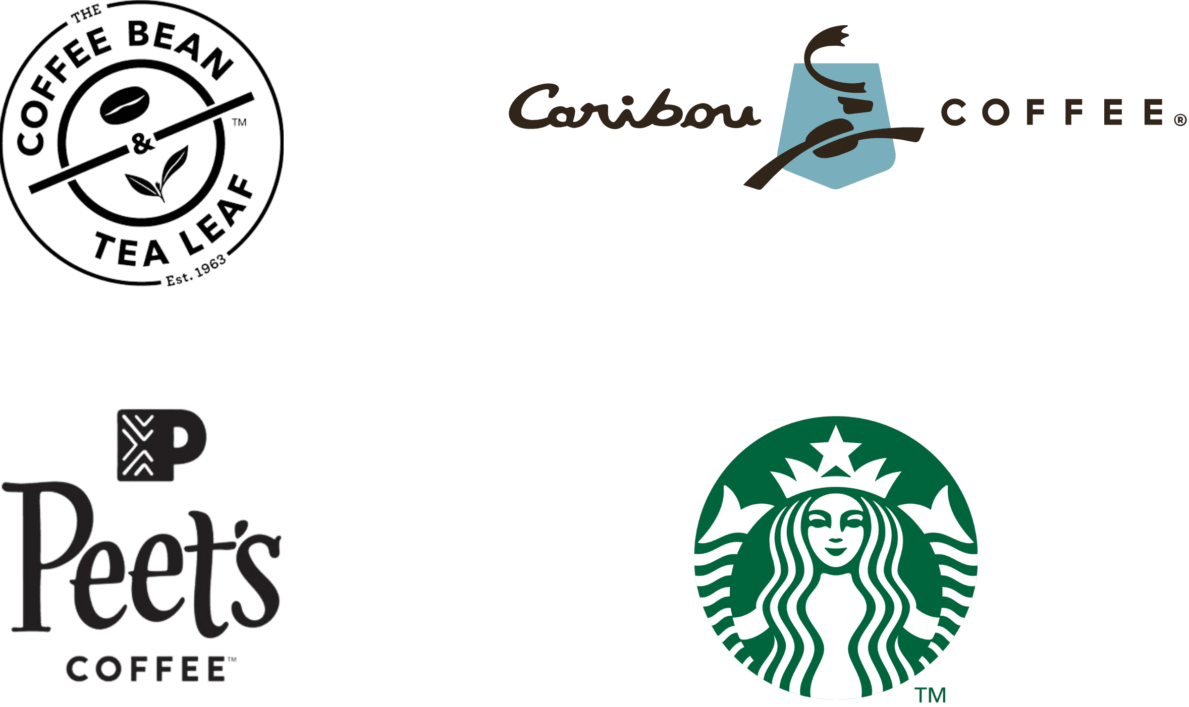
These insights guided my approach to developing a logo that embodies The Whole Bean’s core values while standing out in a competitive market.
Key Values
Enjoy high-quality, well-brewed coffee that feels crafted, not mass-produced.
Value sustainability and brands that reflect a creative, modern lifestyle.
Logo Design Insights
Soft neutral palette with a bold accent to reflect both calm and energy.
A warm, inviting style that signals connection, care, and individuality.
meet the whole crew
While The Whole Bean’s values guided the logo concept, I wanted the design to reflect the people who bring its atmosphere to life. The Whole Crew represents the shop’s heart—diverse, intentional, and full of personality. Their shared love of quality, connection, and creativity helped shape the tone and warmth of the brand’s identity.
Symbolism & Creative Elements


The gorilla reflects the shop’s creative use of the entire coffee plant—just as gorillas make use of every part of their food.
Like the gorilla’s nutrient-rich diet, the shop focuses on high-quality coffee beans packed with antioxidants.
The gorilla also symbolizes community and strength, echoing The Whole Bean’s mission to create a welcoming space for coffee lovers.
Creating The Logo
To bring the character to life, I hand-traced reference images and combined key features into one cohesive illustration—a gorilla with a warm expression, savoring a cup of coffee. The design was meant to reflect The Whole Bean’s comforting and approachable personality. I then refined the sketch in Adobe Illustrator, shaping the details and adding color.
This video has no sound
For the coffee plant, I explored multiple styles—starting with early motifs in Canva, then building the final version in Illustrator using simplified elements of beans, cherries, and leaves. I completed the design in Canva, experimenting with typography and layout to create a logo that feels friendly, confident, and balanced.
Variations

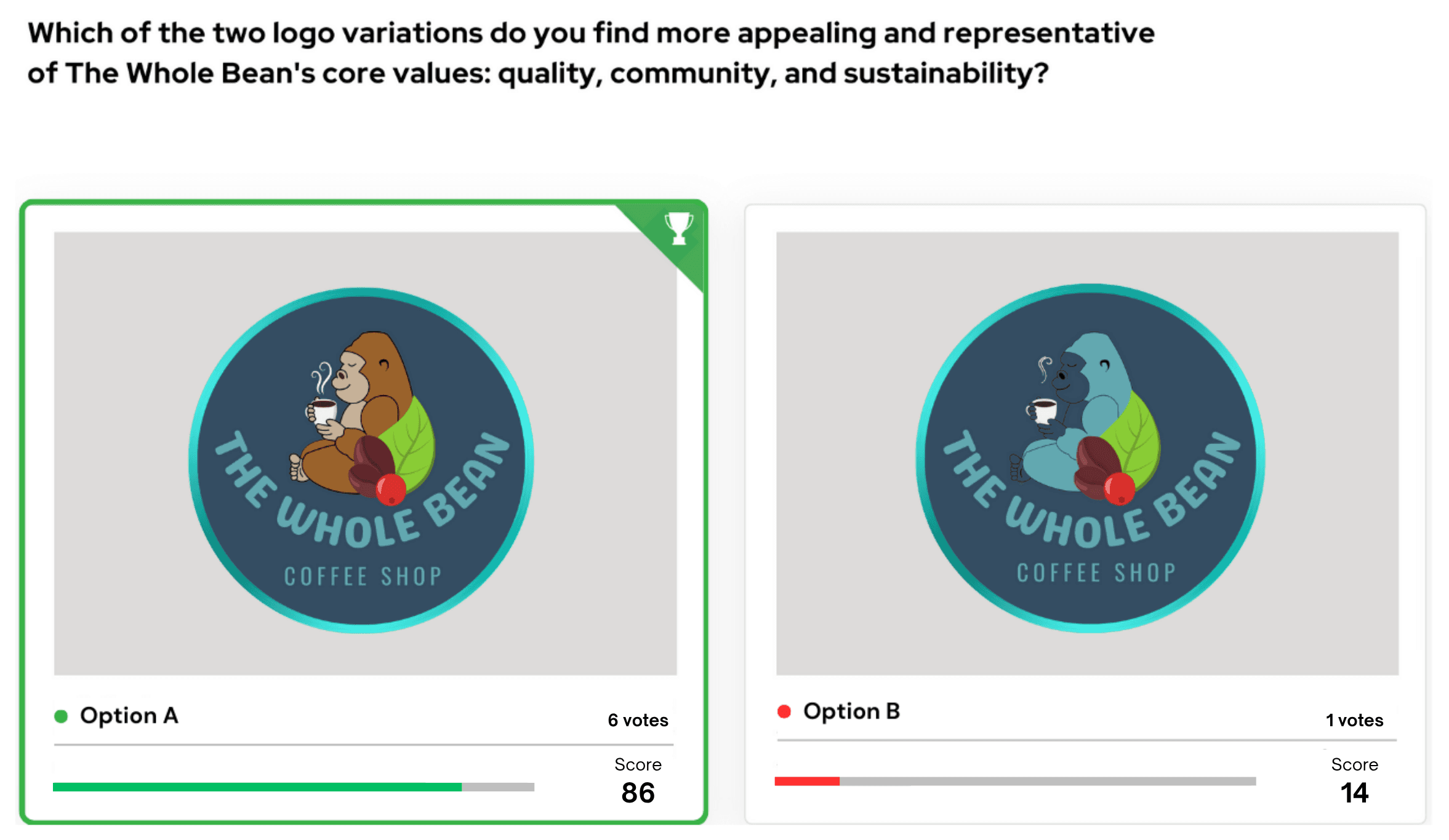
After reviewing the final logo options, the owner recommended adding a circular background in #09435F with a metallic #23b7b0 border to boost visibility and impact. These refinements shaped the final two logos, which were presented for A/B testing.

A/B split testing helped determine which logo variation best captured the company’s values and strengthened brand connection. While both sparked discussion, 86% of participants preferred the brown gorilla, citing its warmth, friendliness, and alignment with the company’s authentic, welcoming personality. These results validated the design direction and reinforced the brand’s identity through visual storytelling.
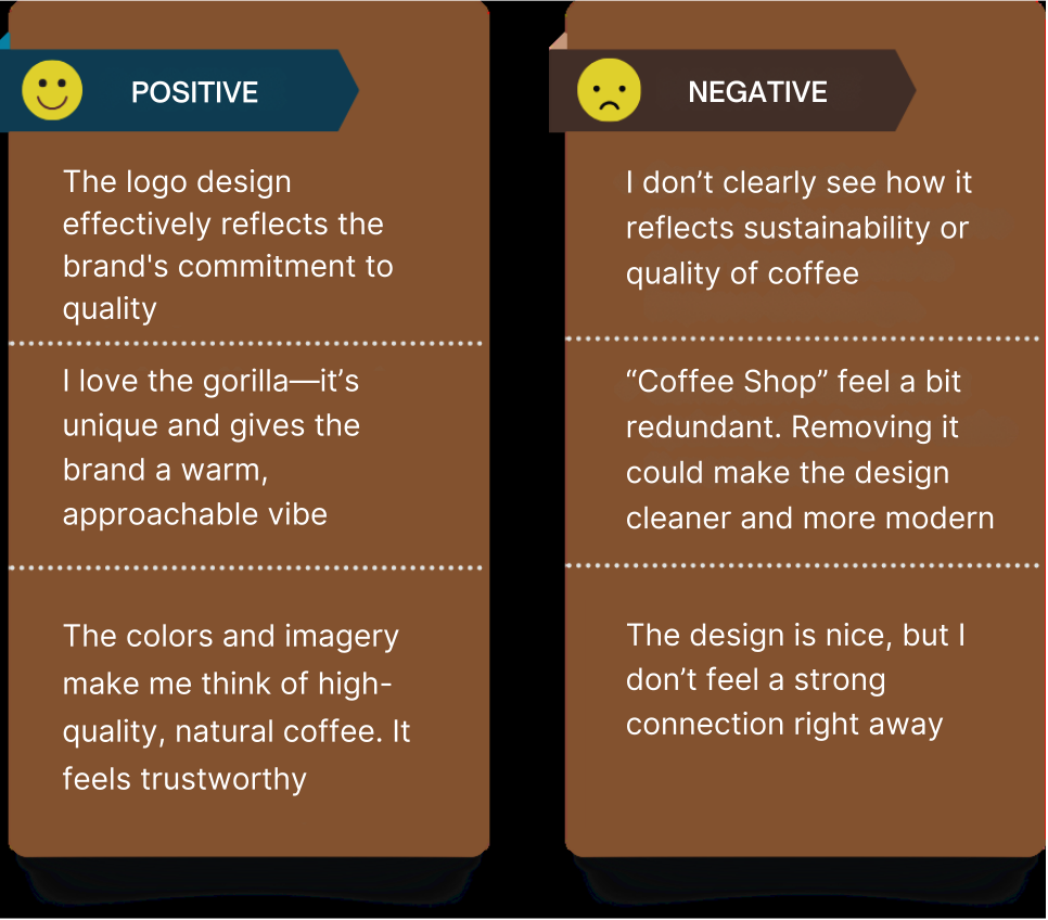
What values or messages do you think this logo is trying to convey?
Does the logo make you feel connected to the brand? Why or why not?
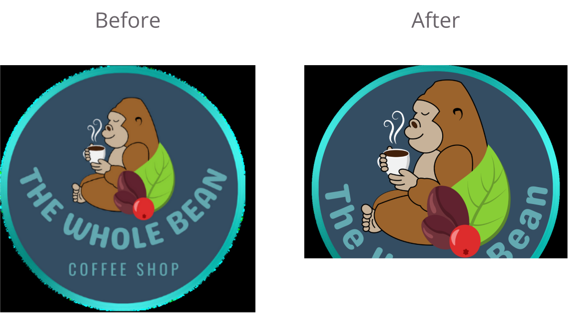
Based on the feedback, I simplified the logo by removing 'coffee shop' from the text, enhancing its adaptability and focus.
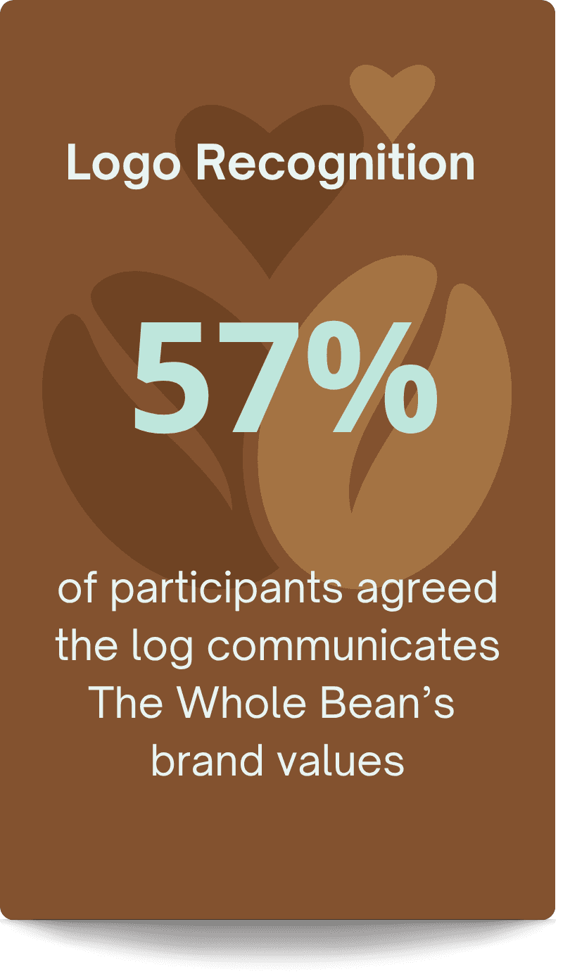
After simplifying the logo, 57% of participants recognized all three brand values: quality, community, and sustainability.
Feedback confirmed the gorilla’s warmth and charm made the design memorable, while removing “Coffee Shop” added clarity and a more modern appeal. These insights shaped the final version and strengthened the logo’s emotional impact.
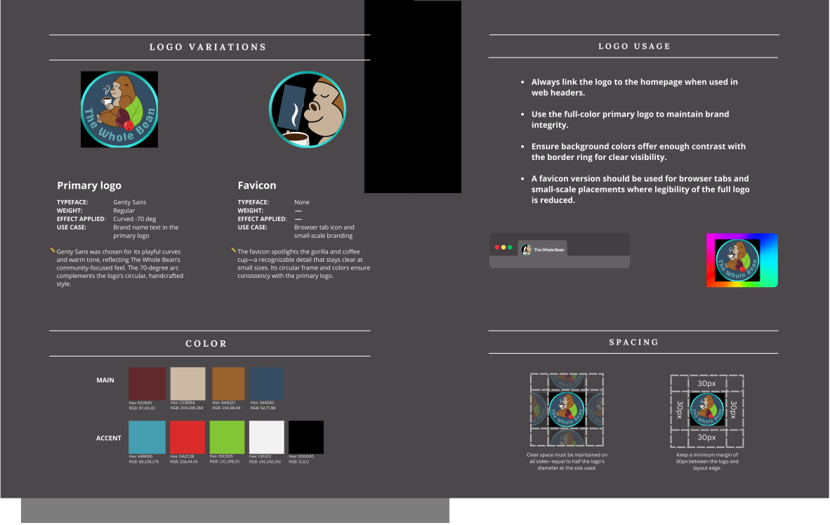
To ensure consistency across digital and physical touchpoints, I created a lightweight style guide outlining The Whole Bean’s core colors, typography, logo usage, and spacing. This guide supports clear, cohesive brand expression wherever the logo appears—from packaging to social to merchandise.
View Full style guide