I designed a weekly order window that automates inventory manifests for the vendor while creating an approachable storefront for seniors.
THE TL;DR
Challenge
Marée faced severe inventory waste and potential customer churn due to unpredictable ordering habits and complex checkout barriers for senior market shoppers.
Strategy
Architected a weekly order window to eliminate procurement guesswork and unified payment workflows around Stripe to establish immediate user trust.
Scope & Deliverables
Payment integration architecture, accessibility-first user flows, and merchant fulfillment strategy.
Outcome
Replaced manual inventory estimates with a static weekly manifest while achieving 100% WCAG AAA accessibility compliance for senior shoppers.
QUICK FACTS
Role
UX/UI Design
Timeline
4 weeks
Platform
Mobile-first
Audience
Senior customers & business owner
01
The Solution Architecture
Balancing Business Logic with Inclusive UX
Designing an ordering experience that accommodates customer needs without disrupting the vendor's operations.
The Customer
challenges
Ordering uncertainty: Unclear deadlines created anxiety about when orders were confirmed or ready.
Payment hesitation: Customers were reluctant to enter financial information into an unfamiliar app.
The Vendor
constraints
Inventory planning: Orders needed to be finalized before Friday's supplier run.
Technical familiarity: The owner already used Stripe and didn't want to learn another payment platform.
↓ Design decisions ↓
A Defined Ordering Window: Saturday–Thursday ordering with visible deadlines gave customers predictability and the vendor a finalized order list.
A Familiar Payment System: Keeping Stripe supported customer payment confidence while preserving the vendor's existing workflow.
02
The Customer Journey
Overcoming digital exclusion through an accessibility-first interface built for senior hand-eye coordination.



1
Heuristic 6: Recognition Rather Than Recall: I placed the three-step cutoff rules directly on the home screen. By giving clear, upfront visibility to the automated schedule deadlines, senior users instantly know how the fulfillment logic works without needing to search through a complex help document.
2
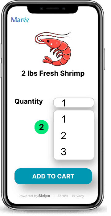
Motor-Skill Friction Reduction: Standard quantity drop-downs are frequently too narrow for senior hand-eye coordination. I engineered oversized form targets with massive padding to ensure non-technical users can make error-free adjustments without physical strain.
3
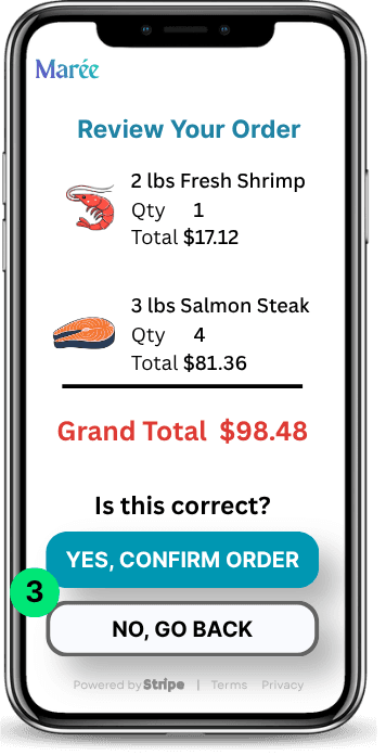
Mitigating Order Anxiety: Older audiences experience high anxiety regarding transaction finality. I built a dedicated order verification step with high-contrast text layout that explicitly totals the items before any financial interaction occurs.
4
System Status Transparency: I included an explicit scheduling safety confirmation message to reassure users that their order is securely locked for Saturday distribution, completely removing post-purchase panic.
03
Preserving the Owner's Workflow
Automating logistics to replace manual guesswork with an error-free procurement blueprint.


1
The Weekly Order Window: The digital storefront remains open for orders from Saturday evening through Thursday at 11:59 PM. By locking the storefront on Friday, the system guarantees a static ledger for the vendor's procurement run. It remains closed through Saturday's market distribution for error-free reconciliation before automatically reopening Saturday evening for the next cycle.
2
The Admin Portal Overview: Non-technical business owners suffer high cognitive load when forced to sort through chaotic spreadsheets on a busy market run. I designed a mobile-first merchant view that automatically strips away clutter—displaying only the final item aggregates required for procurement.
3
The Print/Export Utility: To respect the vendor's workflow habits, I integrated a physical one-click print option alongside a digital CSV export pathway. This simple utility allows her to interact with supplier data exactly how she prefers without forcing a complex technical learning curve.
04
Beyond the UI: Inclusive Design Architecture
To ensure the storefront scales seamlessly for all users, I integrated accessibility directly into the design framework rather than treating it as a final checklist item. Designing for an older demographic required strict adherence to specialized interaction patterns:
Color & Acuity (WCAG AAA): Enforced a minimum 7:1 contrast ratio across all body typography and interactive elements to ensure readability under outdoor market conditions.
Touch Boundary Dimensions: Specified a minimum 48×48px interactive hit target with 16px minimum spacing padding across all UI controls to prevent accidental misclicks.
Form & Layout Hierarchy: Limited form fields strictly to essential data, utilizing 20pt+ satoshi typography and native OS input interfaces to minimize cognitive overhead.
05
Product Strategy: Phase 2 Validation & Risk Mitigation Plan
The Core Assumption
The success of this architecture hinges on two unvalidated assumptions:
1.
Customer Adoption Risk: Senior users will adopt a digital weekly order window over established physical market habits.
2.
Merchant Execution Risk: The vendor can accurately fulfill individual orders on distribution day using only wholesale totals.
Risk Mitigation & Service Design Fallbacks
Omnichannel Fallback Plan (Senior Adoption Risk)
The Friction: Testing may show seniors feel anxious using web browser receipts or email notifications.
The Solution: Pivot to automated SMS confirmations and printed pickup receipts. Sending clear, native text updates with pickup details leverages an existing habit and guarantees transaction confidence without altering the backend engine.
Customer-Level Manifest Utilities (Vendor Fulfillment Risk)
The Friction: Providing only an aggregate wholesale manifest solves buying guesswork but creates packing bottlenecks at the market stall if the vendor has to inspect individual customer screens or rely on word of mouth.
The Solution: Expand the Merchant Portal to generate an alphabetized Customer Fulfillment Manifest (digital + print-ready checklist). This allows the vendor to pre-pack individualized orders on Friday or rapidly check off items at the table on Saturday, eliminating fulfillment errors and leftover inventory.
Validation Testing Roadmap
Senior User Usability Audit: Moderated task-completion runs with low-literacy senior participants navigating the preorder and verification flow on mobile devices.
Target Benchmark: ≥ 85% task completion rate without physical strain or transaction hesitation.
Merchant Logistics Pilot: A 2-week live trial evaluating the accuracy and speed of using generated customer packing manifests during high-volume Saturday market hours.
Target Benchmark: 0% order discrepancy and faster customer checkout.