GPTSheets
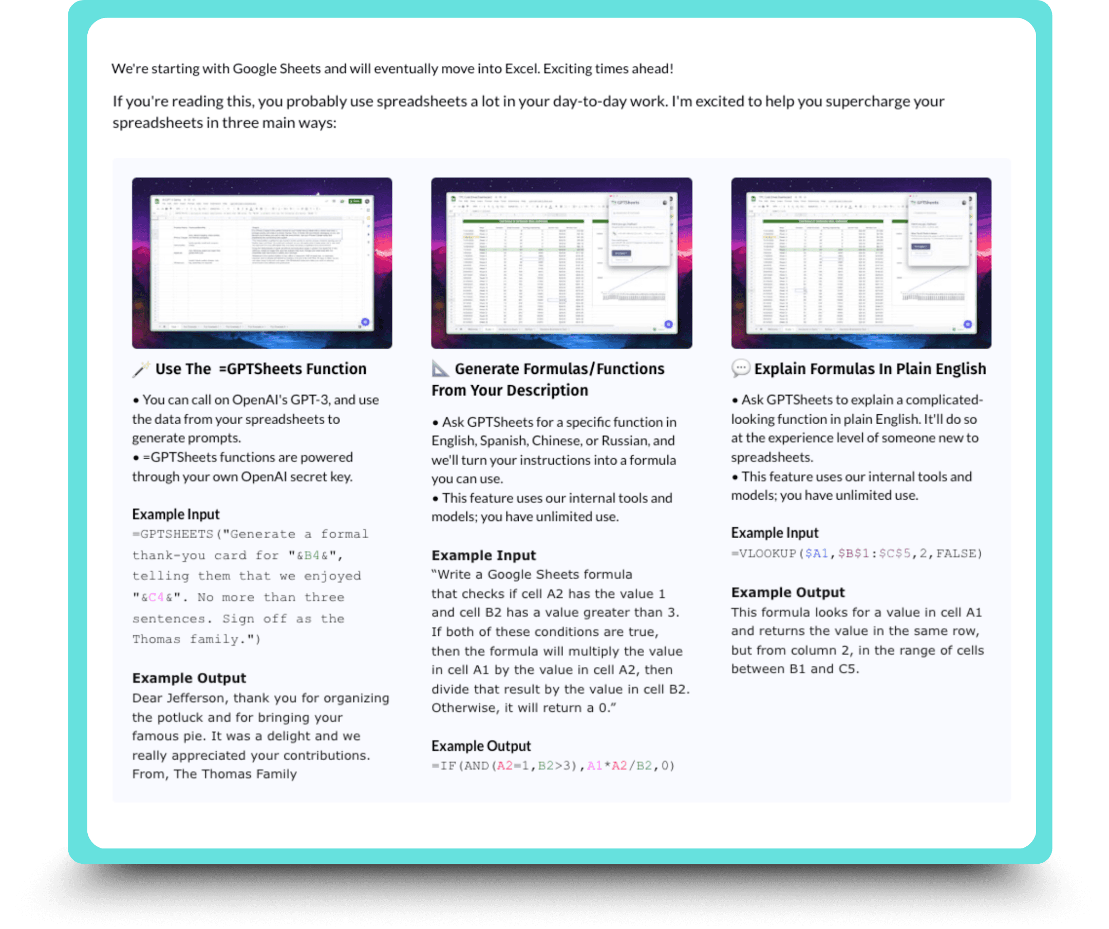
GPTSheets is a Chrome extension powered by the latest generative AI tools that streamlines spreadsheet data management. It boosts productivity by turning everyday language into smart suggestions, formulas, and automated workflows.

The Challenge
Despite its powerful features, only 1 out of 5 users who tried GPTSheets continued using it.
My Role
As the UX designer, my goal was to identify friction points within the dashboard through testing and user feedback, then use those insights to create a more intuitive and engaging experience.
Deliverables
Project Goals
Responsive Wireframes
Interactive Prototype
Usability Testing Report
How might we improve user retention for GPTSheets?
The Design Process
Research & Analysis
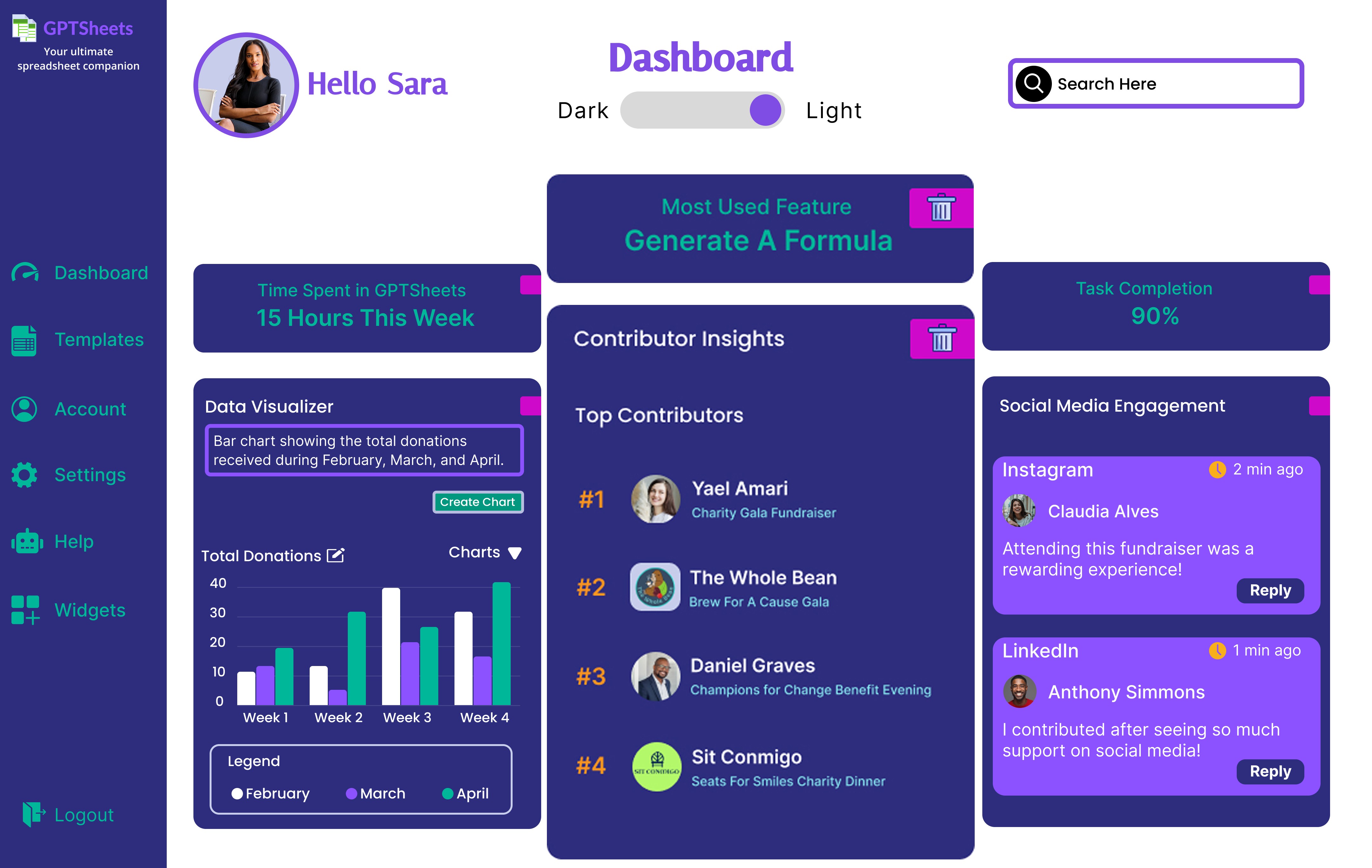
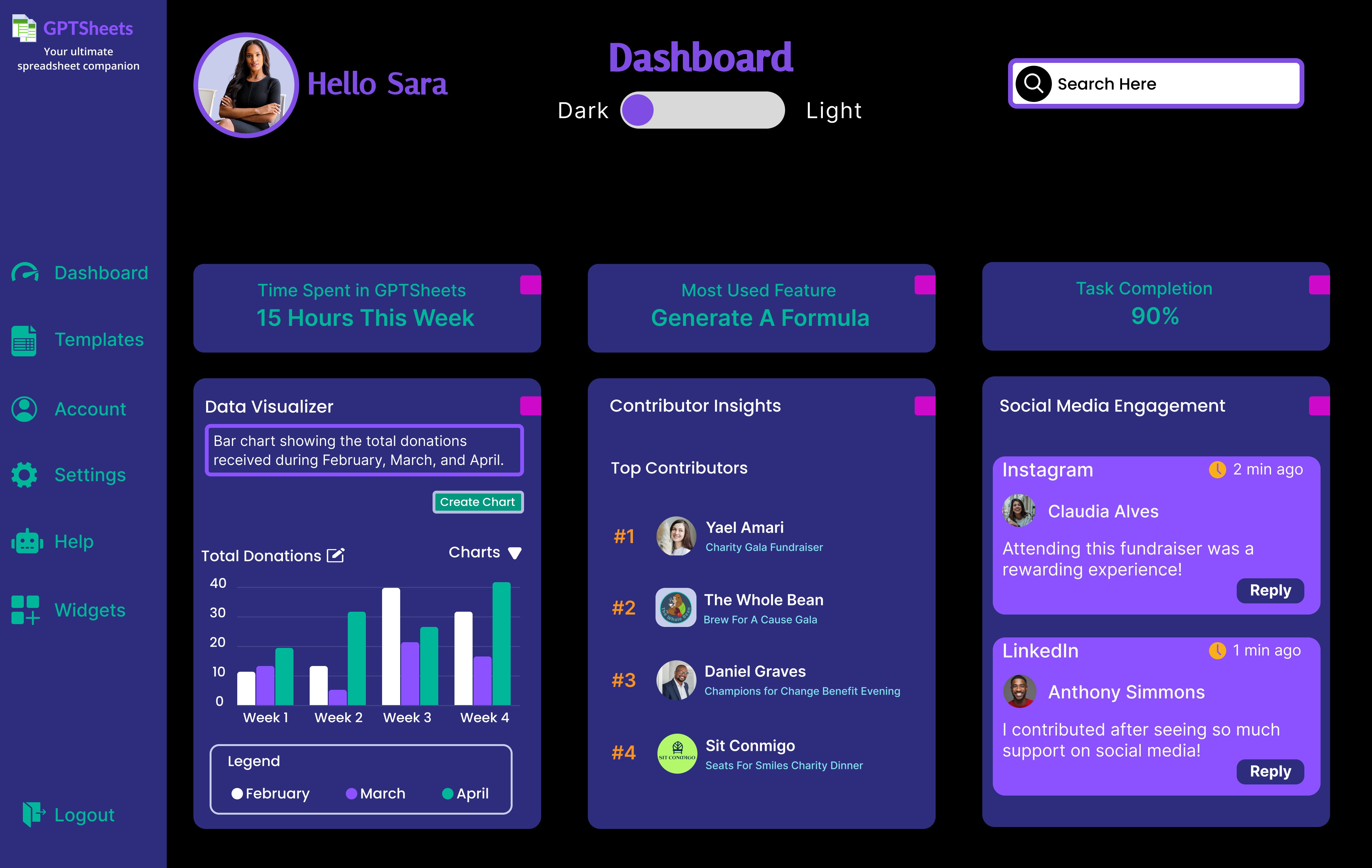
To improve dashboard usability, I first analyzed modern SaaS dashboards to identify patterns in layout, personalization, and visual hierarchy.
Functionality
Customization options
Clear navigation
Interactive elements
Aesthetics
Clean, minimal design
Theme flexibility
Modern design trends


"
Feature update


"
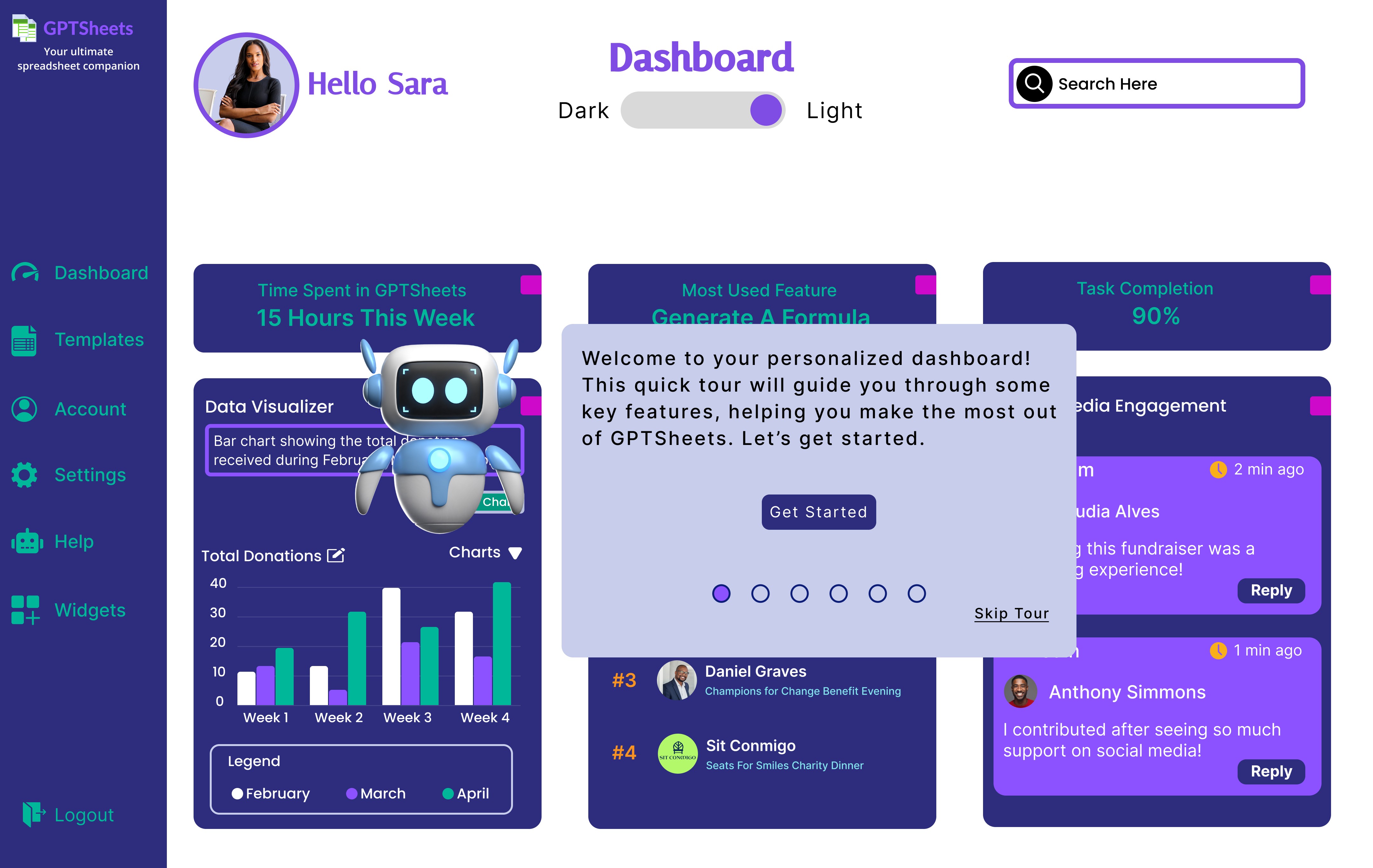
User Control
To support the rollout of new customization features, I designed a brief walkthrough. Although users didn’t request one during testing, walkthroughs are a best practice for onboarding new functionality and ensuring a smooth transition from static to personalized dashboards.

I redesigned the dashboard to reflect user preferences, prioritize relevant features, and ensure ease of use. Usability testing revealed that participants clearly understood how to navigate the interface and felt confident completing tasks. In fact, most testers reported high satisfaction with the new dashboard experience—confirming that the updates improved both clarity and functionality.
"
Onboarding Process Discovery
"

This comment prompted a deeper look into the onboarding process.
To better understand the scope of the issue, I reviewed user analytics provided by the owner. The data showed how many users completed each step of the original onboarding process. I translated these metrics into a funnel chart to visualize where users were losing momentum and identify the most significant drop-off points.
User Abandonment Points

I conducted usability testing to understand why users were dropping off. Testing revealed key points of confusion and disengagement, with the most significant friction occurring at the plan selection stage. Each redesign addresses a specific drop-off by improving clarity and usability, helping users navigate with confidence and stay engaged.


"

Outcome Summary
These results suggest that the onboarding and dashboard improvements made GPTSheets more intuitive and engaging—building the foundation for stronger user retention.
"
Potential Enhancements
These enhancements will streamline workflows and enhance accessibility, catering to diverse user needs while promoting growth and satisfaction.
Accessibility Considerations
Designing GPTSheets was about inclusion as much as clarity. From the earliest wireframes to the final prototype, I focused on creating an experience that was both usable and welcoming for all. I incorporated WCAG-compliant contrast ratios and clear, intuitive navigation.
But accessibility, for me, goes beyond checklists. In this case study, it meant storytelling—making sure every user, no matter how they navigate, felt oriented, informed, and valued throughout the journey.
Interactive Onboarding & Dashboard Experience
To give viewers a clear sense of the user journey, four interactive experiences were designed to showcase key moments before and after setup:
All experiences are included in the prototype. Use the links below or the flow panel in Figma to explore.
What I Learned
This project taught me that not all insights come from direct feedback-some surface through casual conversation. During dashboard testing, I overheard participants chatting among themselves, and one comment unexpectedly revealed a gap in the onboarding experience. That moment pushed me to dig deeper and led to uncovering the real issue. It reminded me that good UX isn’t just about solving visible problems—it’s about catching the subtle ones too. This experience sharpened my instincts and reinforced the value of listening beyond the script.