Designing The Whole Bean Logo

Designing The Whole Bean Logo

A logo built on warmth, community, and creativity.

The Challenge

The Challenge

They needed a logo that would set them apart in a crowded coffee market while staying true to their mission.

They needed a logo that would set them apart in a crowded coffee market while staying true to their mission.

My Role

As the UX designer, my goal was to create a logo that not only stood out but also reflected The Whole Bean’s guiding principles: sustainability, authenticity, and community.

Deliverables

Final Logo Design

User Testing Feedback

Logo Assets Package

Style Guide

How might we create a logo that gives The Whole Bean a unique position in the market?

The Design Process

Research & Analysis

To create an effective logo design, I analyzed popular coffee shop logos, including Caribou Coffee, Starbucks, Peet’s, and The Coffee Bean & Tea Leaf. These logos share common design elements that appeal to customers:

Simplicity

A focus on a memorable image

The use of earthy colors like blues, browns, and greens

A collage of popular coffee shop logos used to inspire The Whole Bean's logo.

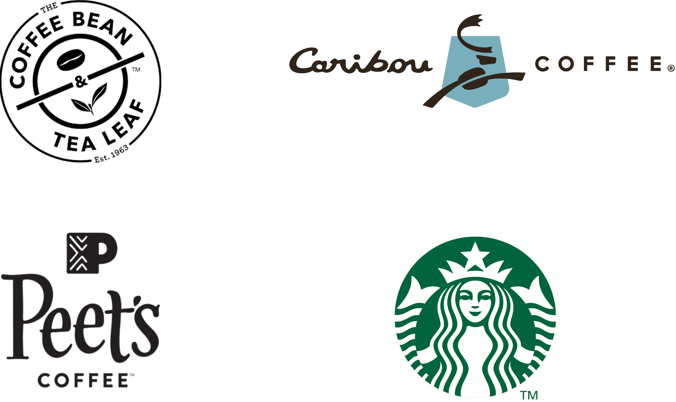
These insights guided my approach to designing a logo that reflects The Whole Bean’s identity while standing out in the market.

Group Persona

Group Persona

I worked closely with the shop owners to understand the vision and core values. Using insights from CRM data, I created a group persona that reflected The Whole Bean’s loyal customer base. This alignment between audience and brand helped guide a logo design that truly captured the shop’s essence.

Key Values

Enjoy high-quality, well-brewed coffee that feels crafted, not mass-produced.

Value sustainability and brands that reflect a creative, modern lifestyle.

Logo Design Insights

Soft neutral palette with a bold accent to reflect both calm and energy.

A warm, inviting style that signals connection, care, and individuality.

meet the whole crew

While The Whole Bean’s values guided the logo concept, I wanted the design to reflect the people who bring its atmosphere to life. The Whole Crew represents the shop’s heart—diverse, intentional, and full of personality. Their shared love of quality, connection, and creativity helped shape the tone and warmth of the brand’s identity.

Symbolism & Creative Elements

I designed a mood board blending earthy tones, communal scenes, and sustainable elements to spark creativity. This visual foundation translated the personas’ values into The Whole Bean's warm personality and principles.

I designed a mood board with earthy tones, communal scenes, and sustainable elements to reflect the brand’s personality. It brought the personas’ values to life and laid the foundation for the logo design.

A moodboard featuring warm tones, natural textures, and cozy coffee shop imagery. Designed to reflect The Whole Crew’s values—creativity, community, and sustainability—this visual set the tone for the logo’s style and personality.
Capturing The Essence

The Whole Bean wanted a logo that would set them apart in a crowded coffee market. To achieve this, I selected the brown gorilla—a figure seldom represented in coffee branding—as the centerpiece. Paired with the coffee plant, the logo gives The Whole Bean an identity that is distinctive and memorable, while staying grounded in its three principles.


The Whole Bean wanted a logo that would set them apart in a crowded coffee market. To achieve this, I selected the brown gorilla—a figure seldom represented in coffee branding—as the centerpiece. Paired with the coffee plant, the logo gives The Whole Bean an identity that is distinctive and memorable, while staying grounded in its three principles.


Sustainability: The coffee plant represents The Whole Bean’s resourceful use of every part of the plant—brewing unique beverages like cascara and coffee leaf tea—and is reinforced by sustainable, eco-friendly packaging.

Authenticity: Like the gorilla’s nutrient-rich diet, the shop focuses on high-quality coffee beans packed with antioxidants.

Community: The gorilla also symbolizes connection and strength, echoing The Whole Bean’s mission to create a welcoming space for coffee lovers.

Creating The Logo

To bring the character to life, I hand-traced reference images and combined key features into one cohesive illustration—a gorilla with a warm expression, savoring a cup of coffee. The design was meant to reflect The Whole Bean’s comforting and approachable personality. I then refined the sketch in Adobe Illustrator, shaping the details and adding color.

This video has no sound

For the coffee plant, I explored multiple styles—starting with early motifs in Canva, then building the final version in Illustrator using simplified elements of beans, cherries, and leaves. I completed the design in Canva, experimenting with typography and layout to create a logo that feels friendly, confident, and balanced.

Variations
Six logo variations exploring plant detail and gorilla color—from warm brown to cool teal. The top and middle rows show detailed coffee plants with different leaf textures. The bottom row features a simplified circular layout with a stylized leaf, coffee bean, and cherry beside the gorilla.

After reviewing the final logo options, the owner recommended adding a circular background in #09435F with a metallic #23b7b0 border to boost visibility and impact. These refinements shaped the final two logos, which were presented for A/B testing.

Circular logo variations showing two gorilla color options—warm brown on the left and cool teal on the right.
A/B Split Testing

A/B Split Testing

A/B split testing helped determine which logo variation best captured the company’s values and strengthened brand connection. While both sparked discussion, 86% of participants preferred the brown gorilla, citing its warmth, friendliness, and alignment with the company’s authentic, welcoming personality. These results validated the design direction and reinforced the brand’s identity through visual storytelling.

A/B testing results comparing two final logos: brown gorilla (score 86) vs. teal gorilla (score 14). Six of seven participants preferred the brown version for its warmth and friendly tone.
Usability Testing

Usability Testing

To evaluate how well The Whole Bean’s new logo communicated its values of sustainability, authenticity, and community, I conducted a round of usability testing. Participants were asked to share their impressions of the logo through focused questions:


Test Scenario:

Participants were asked to provide feedback on the logo’s design through targeted questions:

What values or messages come across most clearly in this design?

Does the logo feel connected to the brand? Why or why not?

Which element of the logo stands out to you most, and what does it make you think of?

What part of the logo stands out most to you, and what does it make you think of?

Usability testing feedback for The Whole Bean logo shown in two groups. Positive feedback: sustainability — ‘The plant imagery makes me think of natural, sustainable coffee’; authenticity — ‘The gorilla feels unique and gives the brand a real, grounded personality’; community — ‘It feels approachable, like a place that welcomes people.’ Negative feedback: sustainability — ‘I don’t clearly see how this connects to sustainability’; authenticity — ‘The design is nice, but it doesn’t immediately feel tied to a coffee shop’; community — ‘The words Coffee Shop feel redundant—simplifying might make it cleaner.'

Takeaway

The feedback showed that the logo communicated authenticity and community well, while sustainability came through for some but not all participants. The extra text “Coffee Shop” was flagged as unnecessary, so I simplified the design to improve focus and adaptability.

Two circular logo variations. Left shows the original with “Coffee Shop” text. Right shows the updated version without it. The change improves clarity and scalability, while preserving the brand’s visual identity.
Outcome Summary

Outcome Summary

After simplifying the logo, 57% of participants connected it more clearly to The Whole Bean’s values. The refinement reinforced the logo’s distinctiveness, strengthening its ability to set the shop apart in a crowded coffee market.

Feedback confirmed that the gorilla’s warmth and charm made the logo memorable, while pairing it with the coffee plant added clarity and balance. The final design gave The Whole Bean a distinctive identity that resonated with participants and, like most logos, leaves room for future enhancements as the brand grows.

Style Guide

Style Guide

To ensure consistency across digital and physical touchpoints, I created a lightweight style guide outlining The Whole Bean’s core colors, typography, logo usage, and spacing. This guide supports clear, cohesive brand expression wherever the logo appears—from packaging to social to merchandise.

View Full style guide

Final Design Presentation

Final Design Presentation

Instagram post on a mobile mockup announcing a collab between The Whole Bean and Scoop & Co. The logo is centered beneath two featured treats—Harmony Bean (coffee-infused ice cream) and Scoop Symphony (vanilla iced coffee). Both debut at Java Jam, a live event celebrating local talent. Logo placement aligns with spacing guidelines, reinforcing flavor, community, and brand unity.
Responsive website mockup displaying desktop, tablet, and mobile views of The Whole Bean site. A rich latte art image and coffee plant leaves set a cozy, craft-coffee tone with the message “Welcome to The Whole Bean.” On desktop, the logo is centered in the nav bar—snug between menu items—respecting clear space rules and reinforcing the brand’s clean, balanced feel.
The Whole Bean’s logo pops on two eco-friendly packages: a brown kraft coffee bag with a peek at whole beans inside, and a teal tin canister of Cascara tea. Designed to feel fresh and intentional, the packaging balances sustainability with shelf appeal—sticking to clear-space rules without losing charm.
A tall, sleek mug cleverly delivers The Whole Bean’s brand message. On the front, “But first” appears above the logo—styling the message in a way that’s playful, spatially aware, and unmistakably on-brand. On the back, a blur of hectic morning phrases—“Get the kids ready,” “Where’s my socks,” “Get to work by 9”—builds tension that the front gently resolves. It’s a visual reminder that before the chaos, there’s always The Whole Bean.
A navy blue T-shirt delivers The Whole Bean’s brand message with crisp, clever style. On the front, “But first” appears above the logo, using scale and placement to turn the shirt into a walking invitation for calm and clarity. The rich navy tone flatters all skin tones and elevates the everyday, while the logo’s metallic border pops against the fabric—blending cozy comfort with a polished, intentional look.
A business card  for The Whole Bean, showcasing a clean, confident brand presence. The front displays the logo centered on a rich brown background, with scattered coffee beans adding warmth and texture. Strategic margin spacing lets the logo shine. On the back, the brand message “But first,,, The Whole Bean” is styled in text. Just below, a short tagline—“Fresh-roasted. Flavor-rich. Unforgettable.”—offers a glimpse of the brand’s personality and promise. Followed by contact details.
Accessibility Considerations

Accessibility Considerations

Accessibility was built into both the case study and the brand materials. My goal was to create an experience that worked equally well for listeners and viewers, using inclusive, user-first language to reflect different ways people engage with content.

Because the project is highly visual, I focused on alt text that supports non-visual storytelling—descriptive, emotionally aligned, and paced to mirror the onscreen flow. I also ensured strong color contrast for legibility and designed the logo to stay clear and readable across different backgrounds.

What I Learned

What I Learned

Designing this logo immersed me in the culture of coffee—visiting shops, sampling blends, and seeing firsthand how atmosphere, flavor, and branding shape customer experiences.

Through iteration, I learned how to anchor design decisions in meaning, creating a logo that not only represents the brand but also resonates with people. This project sharpened my empathy, adaptability, and appreciation for feedback—skills I continue to bring into every project.