MarÉe

Case Study: Marée Preorder Experience

The Hook: How I designed a mobile ordering experience that helped a local seafood business plan inventory around customer demand while giving senior customers the confidence to order online.

The TL;DR

The Challenge: A local seafood vendor relied on inventory estimates before each market day, often purchasing too much or too little seafood. The challenge was to create an ordering experience that supported accurate inventory planning while helping longtime customers transition to online ordering.

The Strategy: I designed the experience around the owner's existing business workflow, preserving Stripe for payment processing while introducing a weekly ordering cycle that aligned inventory planning with customer demand. The experience was intentionally designed to help customers transition smoothly from purchasing at the market to ordering online.

The Outcome: The final design balanced business operations with customer confidence, giving the owner a more predictable way to plan inventory while making online ordering approachable for senior customers.

Quick Facts

Role: End-to-end UX/UI Design

Timeline: 4 weeks

Platform: Mobile-first

Audience: Senior customers & business owner

Industry: Seafood Retail

My Process

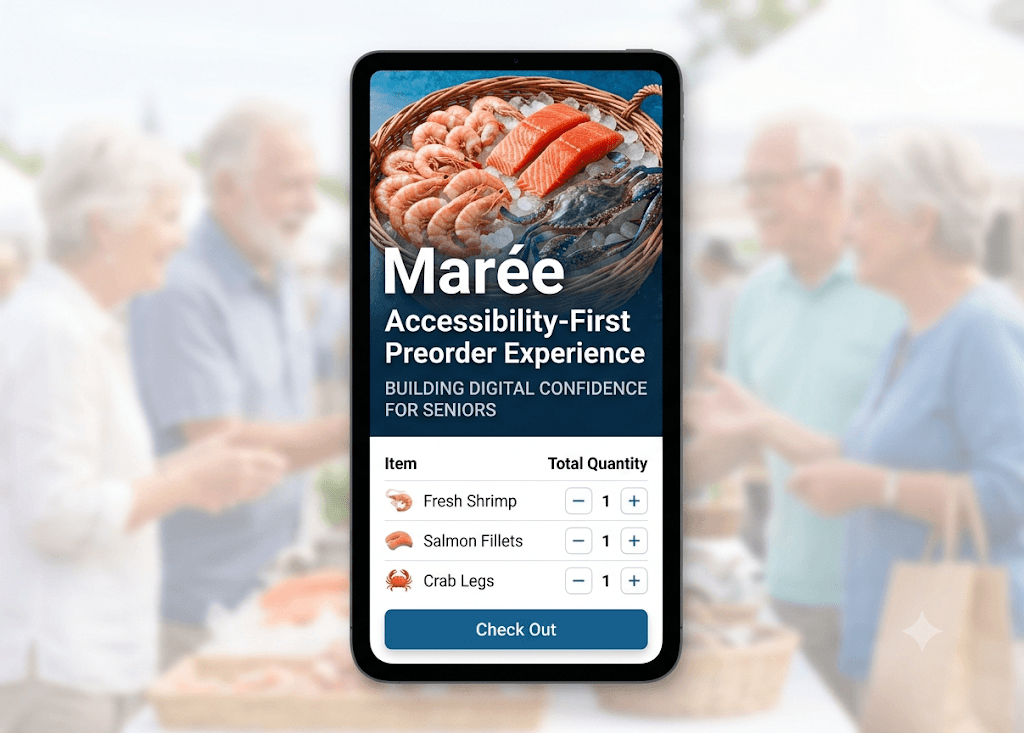
A mobile phone mockup is centered, displaying the Marée application. The app screen shows the title "Marée: Accessibility-First Preorder Experience" and the subtitle "BUILDING DIGITAL CONFIDENCE FOR SENIORS." Below the text is a product selection list featuring simple icons and large quantity adjustment buttons for Fresh Shrimp, Salmon Fillets, and Crab Legs. At the bottom, a prominent blue button reads "Check Out." The phone is overlaid on a softly blurred background image of senior citizens happily socializing in a bright, outdoor market environment.

The Challenge

The Challenge

Relying completely on manual inventory guesswork led to severe supply waste on slow weeks and lost revenue from early sell-outs on busy market days—directly impacting both her business margins and her tight-knit community of loyal, senior customers who value their weekly market routines.

My Role

My Role

As the UX Designer, my role was to design an end-to-end preorder experience that reduced inventory uncertainty without making the technology feel overwhelming for the people using it.

What I designed

Research insights

End-to-end preorder flow

Inventory management logic

Mobile-first checkout experience

Accessibility consideration

How might we design an online ordering experience that supports both business goals and customer confidence?

The Design Process

Understanding the Business

Understanding the Business

Before designing the interface, I needed to understand how the business operated. Each Friday, the owner estimated how much seafood to purchase before customer demand was known. She then spent the entire market day selling until inventory ran out or the market closed. This workflow highlighted an opportunity to reduce uncertainty without disrupting the way the business already operated.

Before designing the interface, I needed to understand how the business operated. Each Friday, the owner estimated how much seafood to purchase before customer demand was known. She then spent the entire market day selling until inventory ran out or the market closed. This workflow highlighted an opportunity to reduce uncertainty without disrupting the way the business already operated.

The Admin Persona: Represents a senior business owner who requires a zero-overhead management routine. The card outlines her need for a static weekly wholesale manifest that eliminates digital clutter and manual inventory guesswork while managing physical stock.

Preserving the Owner's Workflow

Preserving the Owner's Workflow

Rather than changing how the owner ran her business, I designed the ordering cycle around her existing Friday purchasing schedule. Customers placed orders before inventory was purchased, allowing seafood to be bought based on actual demand instead of estimates. Stripe was retained to preserve the owner's existing payment workflow. Together, these decisions reduced waste, improved inventory planning, and streamlined market day operations.

Designing the Weekly Ordering Cycle

Time-Window Logic table: A matrix mapping out the four sequential phases of the 42-hour Time-Window Logic loop. The table displays time frames, system statuses, and operational purposes—such as active order collection, automated locking, and the clean-slate reset—proving how the layout prevents overlapping fulfillment data for the vendor.
What I learned: Understanding the owner's existing workflow revealed that the solution wasn't to redesign the business—it was to design around it. By working with the established process instead of replacing it, the experience supported both operational efficiency and customer needs.

Designing for Customer Confidence

Once the business workflow was established, I shifted my focus to the customer experience. The customers were accustomed to purchasing seafood in person, so the interface needed to make online ordering feel simple, familiar, and trustworthy. Each interaction was designed to guide customers through a new weekly ordering process with confidence.

The Admin Persona: Represents a senior business owner who requires a zero-overhead management routine. The card outlines her need for a static weekly wholesale manifest that eliminates digital clutter and manual inventory guesswork while managing physical stock.

A Familiar Checkout Experience

Stripe was retained to preserve the owner's existing payment workflow while giving customers a familiar, trusted checkout experience. Using a recognizable payment interface helped reinforce confidence at checkout.

A smartphone mockup displaying the Marée application's secure checkout screen. Below the brand name, a dedicated section lists the single order summary item: "2 lbs Fresh Shrimp" priced at "$16.00, tax $1.12 and total $17.12." The screen concludes with a full-width, high-contrast grey button at the bottom that reads "Checkout."

Welcoming Customers to a New Experience

Customers were accustomed to purchasing seafood at the market. A simple welcome screen introduced the weekly ordering process, set expectations, and helped customers feel confident before placing their first online order.

A smartphone mockup displaying the Marée application's secure checkout screen. Below the brand name, a dedicated section lists the single order summary item: "2 lbs Fresh Shrimp" priced at "$16.00, tax $1.12 and total $17.12." The screen concludes with a full-width, high-contrast grey button at the bottom that reads "Checkout."

Simplifying Product Selection

The product selection experience focused on one decision at a time. Large images, clear quantity controls, and a simple layout reduced cognitive load and made ordering feel approachable.

A smartphone mockup displaying the Marée application's secure checkout screen. Below the brand name, a dedicated section lists the single order summary item: "2 lbs Fresh Shrimp" priced at "$16.00, tax $1.12 and total $17.12." The screen concludes with a full-width, high-contrast grey button at the bottom that reads "Checkout."

Building Confidence Before Checkout

Before submitting an order, customers could review their selections and make changes if needed. This extra step reduced uncertainty and gave customers confidence before completing their purchase.

Left Screen: A smartphone mockup displaying a clean, minimal order confirmation summary interface for the Marée application. The top features the brand name "Marée" in a crisp, dark blue serif font. The body of the screen includes prominent bold typography reading "2 lbs Fresh Shrimp", followed by a structured layout showing "quantity: 1", "Total: $17.12". The interface concludes at the bottom with an "Is this correct?" prompt, a solid, high-contrast green button labeled "Yes, confirm order" and a secondary solid grey button labeled "No, go back".  Right Screen: A smartphone mockup showcasing the product detail interface for the Marée application. The layout centers a square, high-quality photograph of raw shrimp wrapped in a traditional mesh bag. Below the imagery, a clean visual hierarchy presents a prominent title for "2 lbs Fresh Shrimp" , "Total $17.12 and a thank you message "Your order is securely saved for Saturday!"

Reassuring Customers After Ordering

A clear confirmation screen reassured customers that their order had been received and reminded them when to pick it up. Providing immediate feedback helped reduce uncertainty after checkout.

Left Screen: A smartphone mockup displaying a clean, minimal order confirmation summary interface for the Marée application. The top features the brand name "Marée" in a crisp, dark blue serif font. The body of the screen includes prominent bold typography reading "2 lbs Fresh Shrimp", followed by a structured layout showing "quantity: 1", "Total: $17.12". The interface concludes at the bottom with an "Is this correct?" prompt, a solid, high-contrast green button labeled "Yes, confirm order" and a secondary solid grey button labeled "No, go back".  Right Screen: A smartphone mockup showcasing the product detail interface for the Marée application. The layout centers a square, high-quality photograph of raw shrimp wrapped in a traditional mesh bag. Below the imagery, a clean visual hierarchy presents a prominent title for "2 lbs Fresh Shrimp" , "Total $17.12 and a thank you message "Your order is securely saved for Saturday!"

What I Learned: Designing for confidence meant supporting customers at every stage of their journey. Clear guidance, familiar interactions, and timely feedback helped make a new ordering process feel simple and approachable.

Supporting Inventory Planning

Supporting Inventory Planning

Once ordering closed, the admin portal transformed customer orders into a consolidated wholesale order for Friday's seafood pickup. This streamlined inventory planning and removed the need for manual estimates.
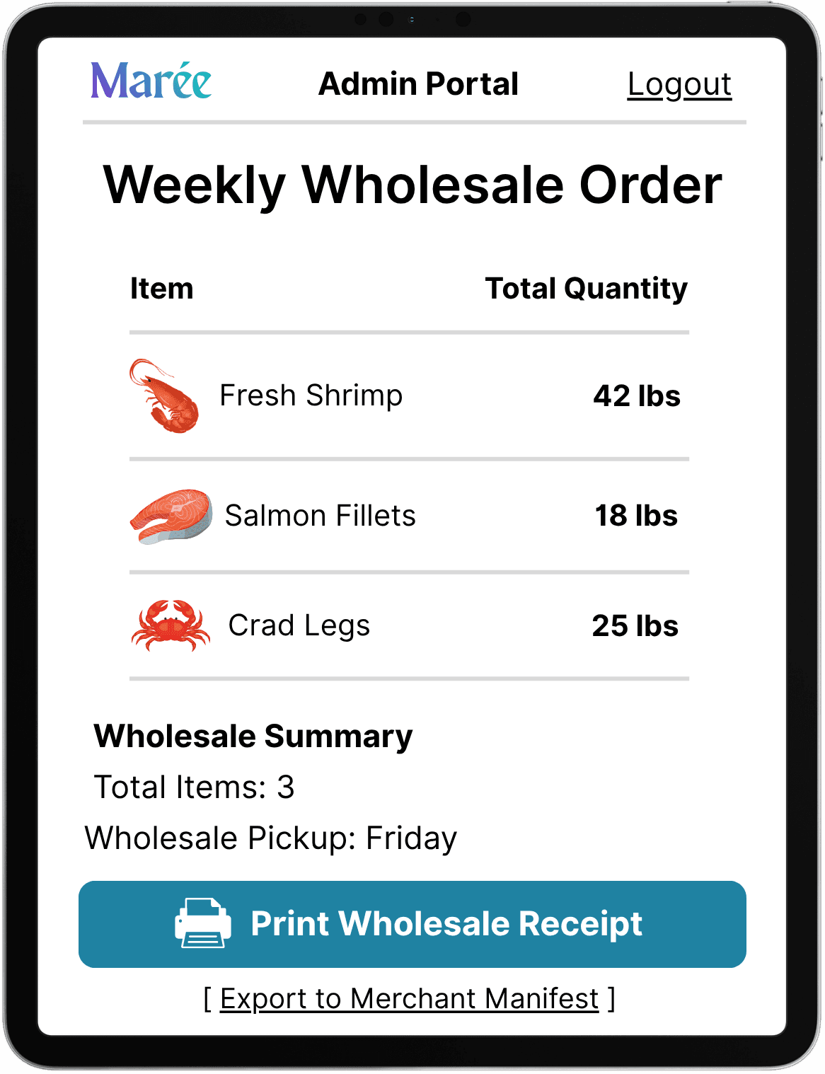
A tablet mockup displaying the Marée application's "Admin Portal" screen. The interface features a clean, light background with a prominent header that reads "Weekly Wholesale Order" beneath the dark blue brand logo. The body of the screen displays a structured list of items with their total requested quantities: "Fresh Shrimp" at "42 lbs", "Salmon Fillets" at "18 lbs", and "Crab Legs" at "25 lbs". Below the list, a "Wholesale Summary" section aggregates the data, stating "Total Items: 3" and noting "Wholesale Pickup: Friday AM". The screen concludes with a prominent teal action button labeled "Print Wholesale Receipt".

Impact & Reflection

Impact & Reflection

By designing around the owner's existing workflow while creating a confidence-building customer experience, the final solution supported both operational efficiency and a smoother transition to online ordering. Every design decision—from the weekly ordering cycle to the customer journey and admin portal—worked together to solve a real business problem while making the experience approachable for senior customers.

This project reinforced the importance of understanding business operations before designing the interface. By taking time to learn how the owner worked first, I was able to create a solution that supported both the business and the people using it.