Sit conmigo
Sit Conmigo: Interactive Preorder System
The Hook: How I designed an incentive-driven preorder experience for an ethical furniture brand, leveraging live-stream transparency to double early customer commitment.
The TL;DR

The Challenge: Initial research showed that less than half of targeted users were willing to preorder due to deep consumer anxieties around the manufacturing process, a lack of progress updates, and upfront financial commitment.

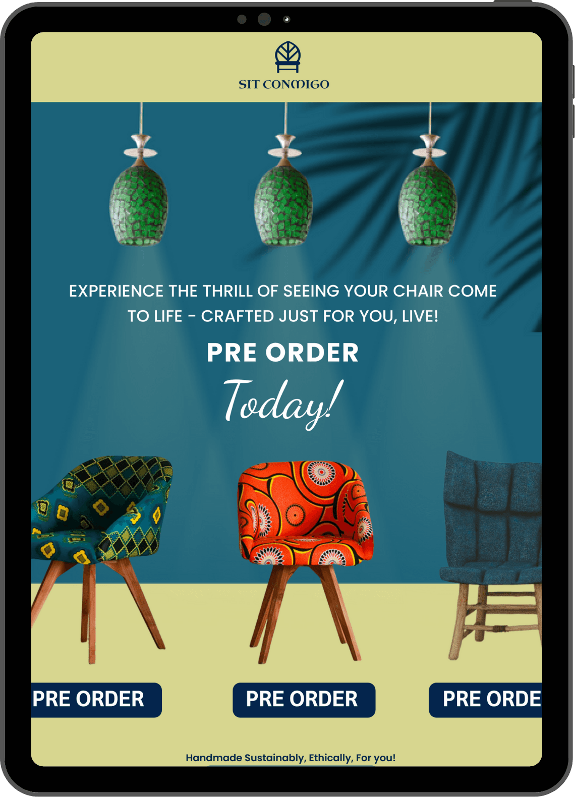
The Strategy: Backed by user preference testing showing that 57% of participants valued production transparency, I designed an end-to-end preorder flow centered around a live broadcast of the build process, optimized for both desktop and email communication.

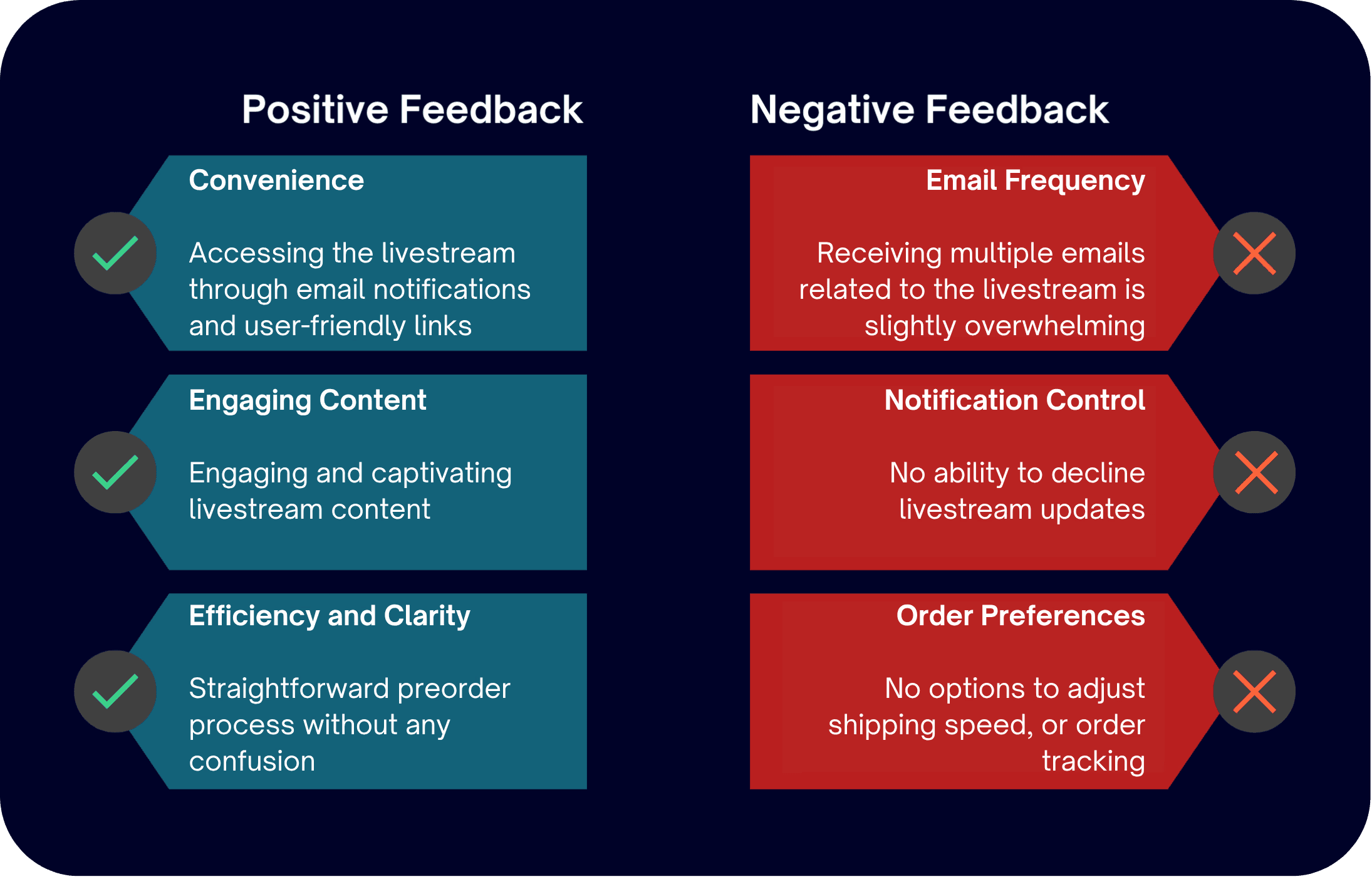
The Outcome: Iterated on usability testing feedback to introduce a "Skip Livestream Notifications" option—balancing user autonomy with brand engagement and delivering a finalized flow that users described as deeply personal, transparent, and trustworthy.
Quick Facts

Role: End-to-End UX/UI Design

Timeline: 6 Weeks

Platform: Mobile-first Livestream Commerce

Audience: Furniture Shoppers

Industry: Furniture Retail
My Process
Sit Conmigo is a modern furniture brand known for its stylish, ethically-made chairs. With a growing fanbase and a new preorder campaign underway, the company is inviting customers to claim their favorite pieces ahead of the next big launch.
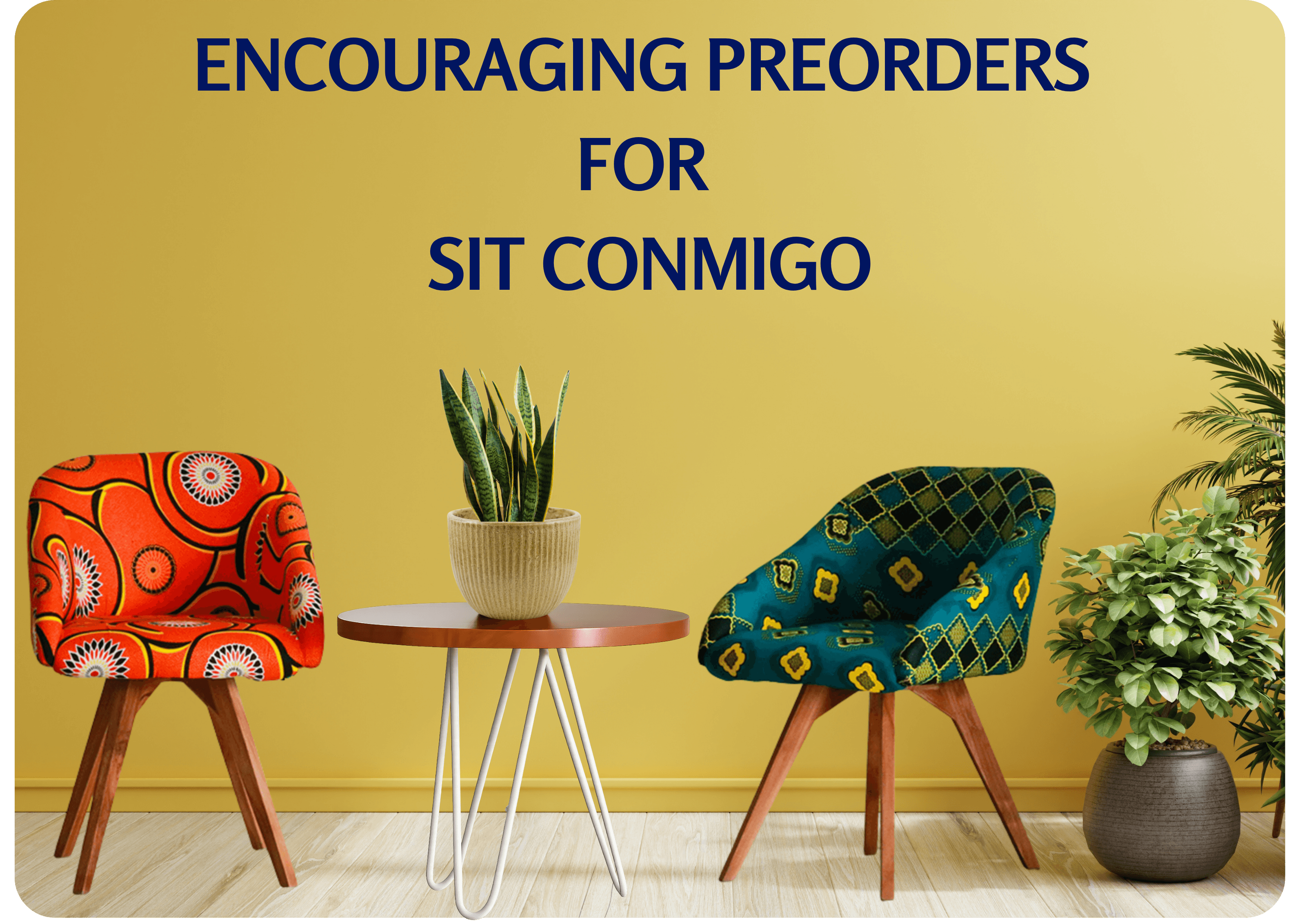
As the UX Designer, I was asked to design an incentive-driven experience that would encourage more customers to preorder
Deliverables
Project Goals
UI Design Files
Interactive Prototype
Usability Testing Report
how might we encourage customers to preorder a chair?
The Design Process
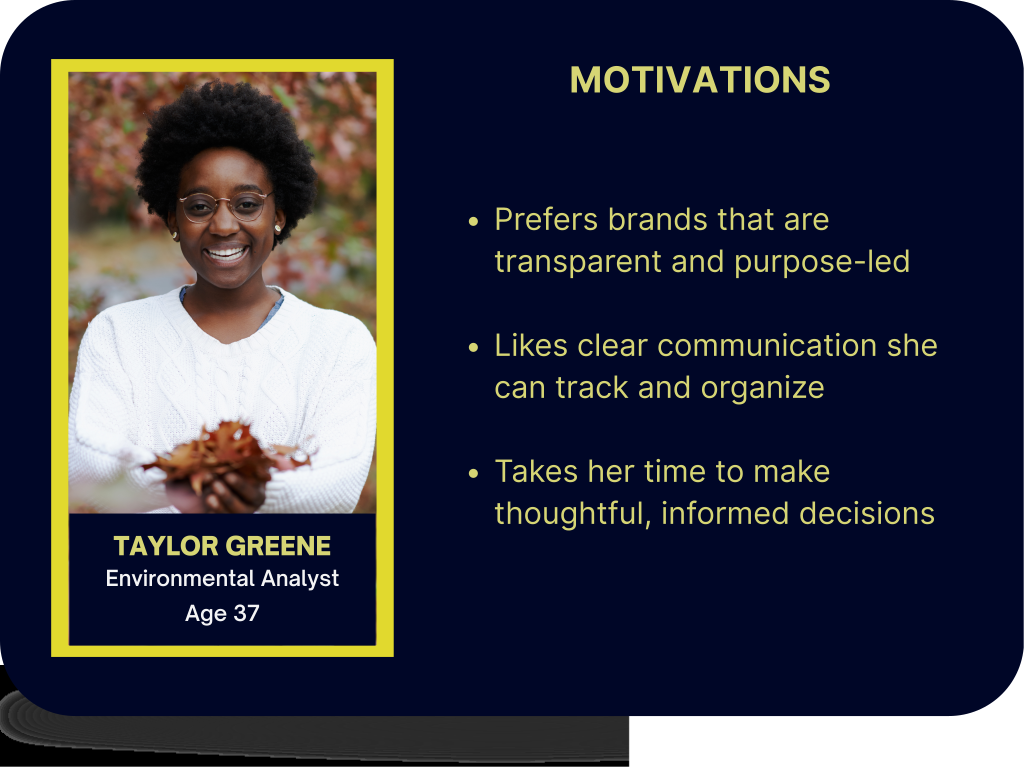
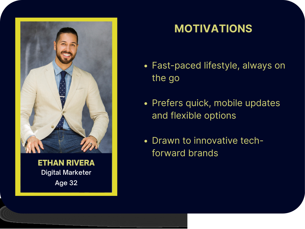
Key takeaways from Taylor
Prefers email updates she can track to set expectations
Values accuracy and transparency
Motivated by ethical sourcing and purpose-driven practices
Key takeaways from Ethan
Drawn to modern, tech-forward experiences
How These Personas Informed My Design
A competitive analysis revealed that similar furniture companies use incentives like early bird access, exclusive discounts, and personalized content to drive purchases. Building on these findings and insights from the customer personas, I created a user survey to refine Sit Conmigo's preorder strategy and identify the most appealing incentives for their audience.
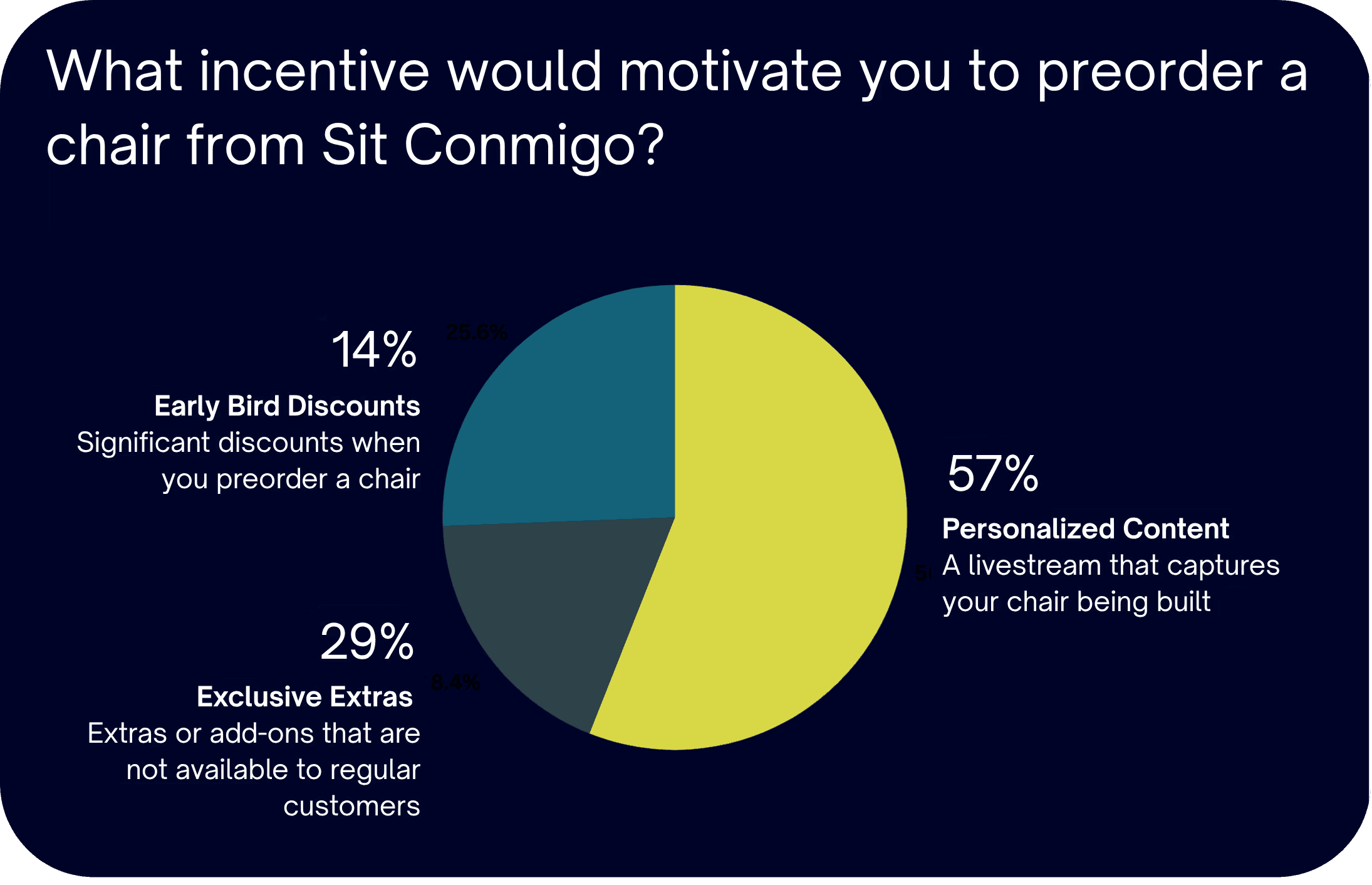
57% of participants identified a livestream of the chair building process as the most compelling incentive, the next step was understanding how customers preferred to receive the livestream. I conducted a delivery method survey to ensure the livestream experience aligned with Sit Conmigo’s customer expectations.

How Participants Preferred to Receive the Livestream



Most participants preferred email as the method for receiving livestream notifications. They appreciated its secure, user-friendly nature — making it easy to access the livestream with confidence and convenience.
Designing The Solution
User Flow & Livestream Integration
I created a video walkthrough to visually illustrate the user flow, showing how users are guided to the livestream during the preorder process. This presentation helps clarify how notifications are integrated and enhances the overall experience.
This video has no sound
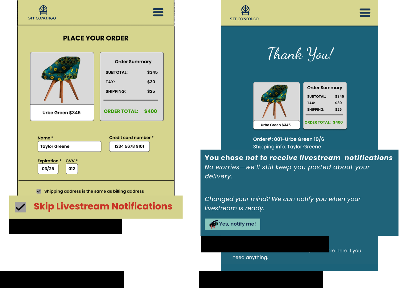

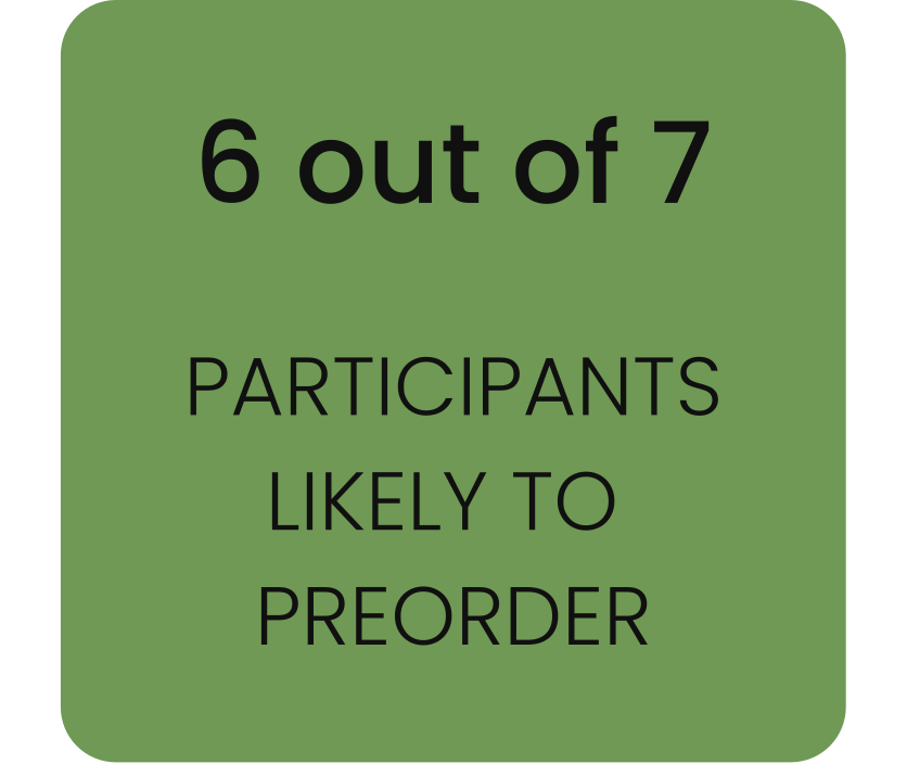
After implementing the livestream experience, the number of participants likely to preorder doubled — increasing to 6 out of 7.
Participants described the experience as personal, transparent, and trustworthy — a meaningful shift toward Sit Conmigo’s goal of increasing engagement and preorder confidence.
Accessibility was thoughtfully integrated throughout this project, with alignment to WCAG guidelines. For the case study, I focused on readable text, high color contrast, and meaningful ARIA labels and alt text. Microcopy and system messages were crafted with empathy and clarity to support emotional safety and reinforce user trust. My goal throughout this experience was to create an inclusive, engaging journey for both listeners and viewers.
This project reinforced the importance of listening to users and designing with empathy. While creating the livestream incentive was exciting, it was the addition of the skip notification option that truly highlighted the value of respecting user choice.
I initially explored multiple branching paths to cover every possible decision — but realized that good UX isn’t always about more options. Sometimes, simplicity is the most respectful choice.
By streamlining the experience and keeping the core interactions intentional, I built not only flexibility, but also clarity and trust.
Great design isn’t just about features — it’s about thoughtful restraint, connection, and confidence in what matters most.